A Brand for a Lifestyle Solution
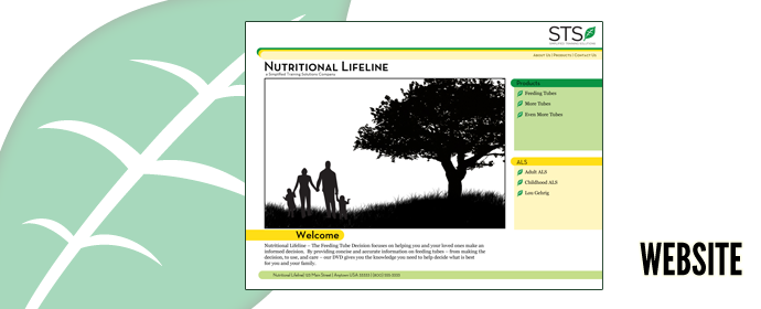
Simplified Training Solutions serves people in need of a feeding tube. Their website and their brand are perfectly functional. They approached Pie a la Mode Productions to explore possibilities for enhancing their brand and revamping their website.
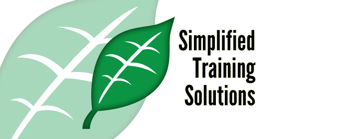
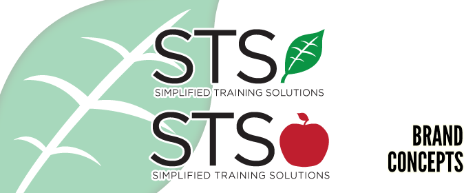
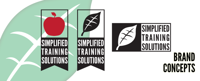
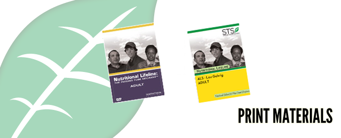
The iconography of our brand redesign – unsophisticated natural elements in silhouette – are thematically connected to the company's mission as well as part of its corporate identity (Nutritional Lifeline). The bright colors against black-white elements project vibrancy, health, and knowledge. The concept was ideally suited for STS/NL's existing range of printed materials, and it provided them a clean, crisp, cogent brand usable throughout their suite of products and presences.
Tools used:
-Adobe Illustrator
-Adobe Photoshop
-HTML, CSS